
So How's That Economy Doing?
The way you choose to approach that question will largely determine the answer you get


Just a quick warning: this post will be quite a bit more technical and geek-y than usual. But I think it’ll help shine some light on how economic indicators can sometimes come a bit unstuck from street-level realities. And that, in turn, should change the ways we assess the real-world impacts of government policies.
Looking back over the first 80 or so posts in The Audit, I see that I’ve invoked gross domestic product (GDP) figures a lot. Whether it was about evaluating the impact of immigration policies, tracking the outcomes of expensive federal programs, or thinking about healthcare spending, I’ve often reached for a quick way to measure Canada’s economy.
In fact, GDP is popular among economists and policy wonks because it seems to be an objective and reliable way to visualize a population’s economic health. But it has its limits.
Sure, quantifying financial outputs does tell us something about what’s happening in our malls, factories, and banks. But some argue that GDP is really nothing more than a description of money supply fluctuations. For the most part, it ignores savings, income distribution, income earned from abroad, and non-economic factors like education and health.
So I figured I should look for something a bit different. First of all, what exactly do I want to measure? At its core, I’m after a way to describe changes to Canadians’ economic wellbeing over time. Adding other metrics on top of GDP and using them to build my own composite index could be useful (and fun).
To that end, I collected Canada’s scores from the years since 1990 for these three measurements (in addition to GDP):
Gross National Income (GNI): GNI measures the total income earned by a nation's residents and businesses, including income from abroad - thereby accounting for international income flows. [Data source: Macro Trends]
Household Net Saving: The Saving Rate represents the portion of income that households or businesses set aside rather than consume immediately. [Data source: Statistics Canada]
Human Development Index (HDI): A UN-based index that combines indicators of life expectancy, education, and per capita income. [Data source: Human Development Reports]
While on their own, none of those is perfect. But combined into a composite index, they can provide a more accurate view of how the lives of the average Canadian might have been changing over the years.
This graph compares GDP performance since 1990 with my composite index:

The first thing you’ll probably notice is how sharply my index grew after 2019 compared with the GDP. Search your fading memory for anything unusual that might have happened after 2019: could that have something to do with a - what’s the word - pandemic? It could!
Most of that growth would be due to Canadians’ unusually bloated household savings. And those savings can obviously be traced to two causes:
There were no vacation, (non-Netflix) entertainment, and restaurant destinations on which to spend our money
Many people received government emergency support payments
By contrast, the GDP only measured the reduced commercial activity and therefore its score dropped.
It’s also worth noting how the decline in the composite index during the 2008 financial crisis was significantly shallower than the GDP through the same period. That might be due to government policies designed to support households through the tough times. Again, this is an effect which you wouldn’t expect to see reflected in GDP fluctuations.
Can we apply our new index to provincial economies? Sort of. Although for technical reasons we’ll have to play around a bit with our data sources. In the end, I decided to construct our provincial composite index using changes over time to these measurements:
The “per capita” income of economic families and persons not in an economic family. [Data source]
The household saving rate [Data source]
The participation rate in secondary school education for population aged 15 to 19. [Data source]
The age-standardized mortality rate (all causes). [Data source]
When I combined those four metrics into a single annual score starting in 2020, here’s how it looked:

Ok, you don’t have to tell me: I can see for myself how that’s useless. There’s way too much information squeezed into way too small a space for us to make sense of it. But this next version shows index values from all ten provinces averaged into a single trendline:

It’s obvious that, except for the weirdness of Covid’s 2020, things have been trending down pretty consistently at least since the century began. Now compare that to a similar graph representing averages of the standard provincial GDP:
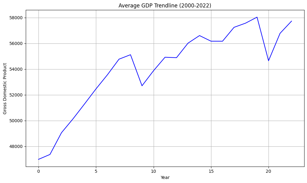
That’s nearly the mirror-image of our composite index! What’s going on?
Well for one thing, our index is much more focused on quality of life. Even the financial indicators we used (saving rate and household income) are tilted more towards home finances than the GDP’s productivity outputs. And, while the other two metrics (improved life expectancy and education achievement) are often the result of healthier economies, they’re not always synonymous.
I think it’s interesting just how far out of sync with each other those two measurements were. It’s almost (but not quite) like the conditions necessary for the success of one set of indicators guarantee the others will degrade.
Here’s how the composite index scores changed between 2000 and 2022, province-by-province:
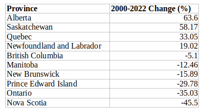
Let’s try to understand those scores. Quebec and PEI experienced the largest improvements in mortality rates but, in fact, life expectancy moved in the right direction for all provinces. Similarly, inflation-adjusted household income increased between 25 percent (Quebec) and 44 percent (Alberta). That's the good news.
Even with the jump in 2020, household savings fell in six of the ten provinces from their 2000 levels. And all provinces' savings have dropped by an average of 84% since their lockdown-driven peak in 2020. The primary villain here would probably be rising housing costs: who can afford to save?
The education participation figures are odd. Ontario's rate, for instance, fell from 72 percent of individuals 15 and older enrolled in high school in 2000 to just 62 percent in 2022. PEI, Nova Scotia, New Brunswick, and British Columbia also saw significant enrollment declines. And those aren't a recent (post-Covid) trend, but problems that have been developing over time.
You’re free to second guess some of my choices here. Perhaps, for example, my index gives education participation too much weight. But the real point of the exercise is to show how complicated it can be to accurately measure the impact government policies have on our everyday lives. I hope to incorporate these indexes into future research.
Really interesting to see the disconnect between your composite index and GDP. It’s not the GDP is arbitrary, but that it only captures a small slice of what is important in our lives.
Thanks. It's often been difficult to listen to some of the discussion of productivity that focuses solely on GDP per capita. This is starting to change, and these measures have a lot of validity. It will be interesting to see where they go in the next while.