
Public Sector Employment Trends and Government Productivity

Both before and after their election last year, the federal Liberals acknowledged that their spending was unsustainable. They promised to reduce costs in part by reducing the size of the public service.
Two years ago, I wrote here on The Audit about using government employment as a measure of public sector productivity. Since governments don’t produce anything tangible - and the quality of the services they provide doesn’t seem to be improving - what other productivity measure could there be?
You might remember this graph from that earlier post. It represents the federal government employment population as a proportion of Canada’s total population:

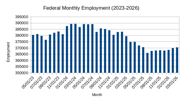
Since then, the proportion climbed yet further to 0.94 percent in 2024 before falling back a bit to 0.91 percent in 2025 and then 0.89 percent by Q1 2026. All things considered, that’s not a lot to show for nearly a full year of post-election policy implementation.
This chart, based on Statistics Canada data, shows raw employment numbers over the past three years. You can see that there was a decline in the months following the election, but hiring has since returned to its older growth trend.
So the quick answer to “have the federal Liberals meaningfully implemented their public sector reduction policy yet?” would be “No.” And the same answer would apply to measures of government productivity. They’re still hiring more people to provide static or even reduced service levels.
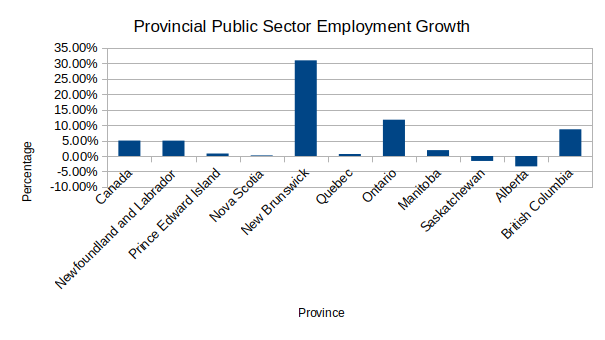
Believe it or not, federal workers make up a minority of Canada’s public sector. And given the near-universal employment growth at both the provincial and municipal levels, we’re forced to conclude that productivity hasn’t been stellar anywhere in the country.
This chart shows us employment growth (as a percentage) between April 2023 and March 2026 by province:
There are obviously some noteworthy changes going on there. However we’ll need some context for that to make sense of those numbers. So this next chart gives us provincial employment per capita. That is, how much public sector employment grew in relation to population changes:
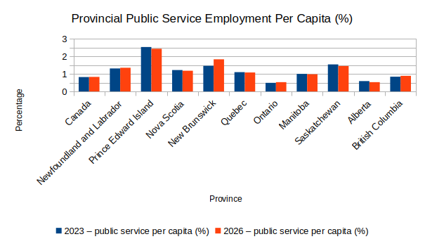
You can see that one out of every forty residents (not workers: residents!) of PEI works for their provincial government in some capacity. And New Brunswick and Saskatchewan aren’t too far behind. Ontario and Alberta appear to be the most efficient in the country.
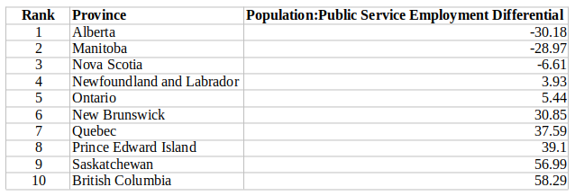
That would seem to show an interesting shift from the results I reported in this post from two years ago:
In any case, Canadian municipalities have something to say to both provincial and federal governments: “Hold my beer transfer payment.”
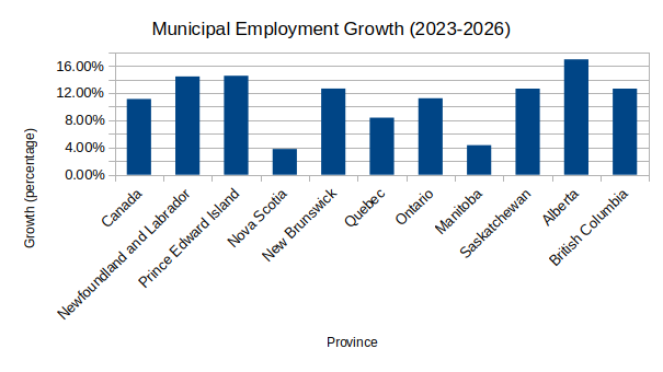
The 515,689 individuals who proudly carry the lanyard for Canada’s cities and municipalities have reason for joy: there’s currently a whopping 11.12 percent more of them than there were just three years ago. Think that’s a big number? There are actually 44 percent more of ‘em now than there were in 2006.1
This chart breaks down municipal employment growth over the past three years by province:2
None of this is to suggest that public servants as a group do nothing useful and don’t care about their work. But it does hint that government hiring isn’t guaranteed to solve real-world problems. And it would also seem that Canadian government policy makers at all levels haven’t yet sufficiently absorbed the idea that irresponsible spending is - well - irresponsible.
Although to be fair, municipal populations have grown considerably over those years.
I will admit that showing per-city numbers would probably be more useful. Perhaps some other time.
The pctg of population number is a good measure, but we should be looking at broad public sector and govt funded NGOs too