
Do National Healthcare Funding Systems Make a Difference?


It’s always fun to see how Canada’s healthcare system ranks against the rest of the world. But it could also be useful, because such comparisons might just point to what we can change to make things better here at home. So when I recently came across some rankings on the World Population Review site, I couldn’t resist diving in.
Feel free to explore all the data I used for this post at this link.
The site featured multiple rankings, including five separate measures of overall quality of healthcare:
Legatum Prosperity Index which measures objective outcomes like life expectancy, disease burden, and sanitation access.
CEO World Magazine whose rankings are primarily based on surveys of healthcare professionals.
US News & World Report which measures things like capacity and accessibility through surveys, data, and expert analysis.
Numbeo which is based mostly on user satisfaction surveys.
World Health Organization which measures healthcare affordability and outcome metrics.
The really nice thing about having easy access to all five of those rankings is that we’re getting a broad range of methodologies, increasing the chances that the numbers will actually mean something.
Overall Rankings
The first thing I did was normalize and combine the scores from all five rankings. Hopefully, this will give us a more robust comparison. Canada came in at number 34 (out of 196 countries). The U.S. - which spends far more on healthcare per capita than anyone else - ranked 41st and the U.K. was just one stop higher. Here are the top 15:

After seeing those results, my first thought was “Colombia in third place? Really?” While I can’t be completely confident this isn’t just a weird statistical anomaly, it does seem that Colombia’s reputation for medical tourism and general affordability could be playing legitimate roles here.
Other Metrics
Besides the overall rankings, World Population Review also provided specific rankings, including ICU beds per capita, procedure wait times, and best doctors. Let’s look at those one at a time.
Here are the top-14 ranked nations for ICU beds per 100,000 residents (Canada is tied for 10th spot with Japan):

Despite scoring 46th overall, Turkey is particularly well stocked in the ICU beds department. That’s certainly an important measure of preparedness, but it’s obviously not the whole story.
Only 16 countries were rated by median wait times for surgery. Specifically the data covered cataract surgery, hip replacements, and knee replacements. Here are the average wait times (in days) for a combination of all three procedure categories:

Canada’s 97-day delays earn it ninth place overall, but for people living with pain while waiting for solutions, that’s small consolation.
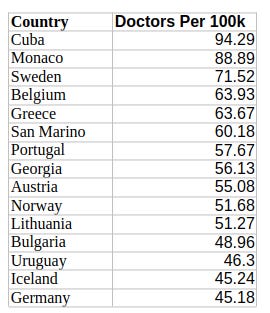
Determining the country with the “best doctors” is only incrementally sillier than the average patient assuring us that Hospital X has the best doctors in town. How do you measure “best”? And where did you go to get data that’ll intelligently cover every doctor?
The World Population Review points us to BSCHOLARLY for help - although I really don’t know how useful it’ll be. You see, that ranking isn’t much more than an enumeration of famous medical discoveries and innovations. Canada’s relatively high ranking, for instance, seems to be based on Banting’s discovery of insulin (in 1923!) and Roberta Bondar being the first neurologist to travel to space.
Nevertheless, we’ll throw this one into the mix, too:

The best doctors data also covered doctor density (i.e., the number of doctors per 100,000 population). Here’s how that looked:
Canada ranked 74th with 25 doctors/100k.
Measuring Correlation
I then ran a regression analysis for three of those measures against our overall healthcare ranking (I left wait times out). Was I in for a surprise.
The coefficient for ICU beds per 100,000 residents was 0.4467 (with a p-value of 0.216). That suggests a statistically insignificant correlation with healthcare quality. Fine.
Higher densities of doctors in your population are apparently negatively correlated to the quality of healthcare (coefficient: -0.5366, p-value: 0.035). If we knew that the relationship was causative (which we don’t), it would mean that more doctors lead to worse outcomes. Interesting.
But here’s the real kicker: somehow, there’s a positive and statistically significant correlation (coefficient: 2.5303, p-value: 0.007) between the discoveries and innovation rank and overall quality of healthcare! After all these years, good ole Fred Banting is still making a difference.
Weighing the Quality of Funding Models
Can we use our overall healthcare quality data to identify the most effective funding model? Perhaps.
Broadly speaking, developed countries use one of three classes of funding models:
Universal public healthcare funded by general tax revenues.
Social Health Insurance (SHI), where the government requires employers and individuals to contribute premiums to health insurance providers. There’ll often be safety nets for low income or unemployed people.
Two-tier systems where private healthcare providers are allowed to exist side-by-side with publicly-funded systems.
Among the 38 OECD member countries (excluding Costa Rica, for which I couldn’t find complete data), 20 use some form of SHI, 15 (including Canada) have tax-funded care, and two (the U.S. and Mexico) have two-tier systems.
Sort of.
You see, there are so many subtle variations between, say, SHI implementations, that it’s possible to define some systems as either SHI or two-tier. Specifically, Australia, New Zealand, Ireland, and Israel have private insurance markets that are strong enough to be considered a second tier.
Nevertheless, I went with a tighter definition for two-tier that covered only the U.S. and Mexico. Here are the average scores for each category:
Tax funded: 379
SHI: 373
Two-tier: 384
A higher score equals higher quality of care. The numbers are close enough to each other to suggest that the particular funding system a country uses may not have all that much impact on healthcare quality. Perhaps, then, we should focus more on cost effectiveness.
Without having looked at those “quality” measures in any great detail, I can say that most composite quality measures for health care combine weighted averages of apples, oranges, cows, and cars to come up with a totally meaningless number.
From the societal level, you end up looking at the health of the population, which depends not only on health care but also on income levels, education, clean water, sanitation, etc., etc. Across the world, the public health things vary a lot, so things like differences in sanitation matter more than access to doctors (this is why you can’t directly compare Cameroon to Canada). Within populations in first world countries, we’ve mostly fixed the public health problems, so income is the thing that makes the biggest difference, with the top quintile have far better health outcomes than the lowest quintile.
So, for the entire population, you can look at things like life span, rates of disease, etc., but the differences you see may have nothing to do with health care, OR they might reflect too much access to health care (or the wrong sorts of health care). An excess of ICU beds may be the result of greater levels of critical illness, or inadequate access to good care in “normal” beds. One way or the other, those ICU beds will be filled, and somebody will be making the case that more are needed. Generous access to health care translates to excess diagnoses (over-diagnosis), which don’t improve health in terms of lifespan, etc., but do mean more people are in hospital beds, on meds, having surgeries, taking prescribed drugs, etc.
Looked at the other way round, what matters to the individual is something like “timely access to effective care when I need it, which is when I’m sick”. By that measure, the Canadian system isn’t doing very well. 15% of the population have no family doctor. After that, just about every report you see highlights our horrendously long wait times for diagnostic testing, specialist consultations, surgeries, etc. Emergency departments (when they are open) are over-crowded, with long waits and ambulances lined up outside. Admitted patients line up in emergency, for lack of access to inpatient beds. Patients discharged to nursing homes linger in hospitals, for lack of nursing home beds. Those who need home care stay in hospital longer, waiting for home care to become available. There are even line-ups for preventative care, like flu shots, these days! The care you get, when you eventually get it, is generally of reasonable quality, but there are far too many delays with their associated inefficiencies.
The lack of timely access does show an effect in the high level measurements, like expected lifespan, but the effect is diluted and delayed. Even so, the various delays in our system have increased post Covid, and the expected lifespan at birth has dropped, for the first time in decades, not so much because of Covid-related deaths (which mostly happen in the very elderly), but more because of the knock-on effects on our health care system (lots of surgeries, testing, preventative care, etc. cancelled or deferred during the pandemic).
All of which is to say that I think you need to look at quality measures that emphasize timely access to care, things like wait times for hip and knee surgery, etc. (bearing in mind you wait months to see an orthopedic surgeon before you even get on the wait list for the surgery). I think you would find that our relatively expensive system performs very poorly on access, and hence quality, and hence the cost-effectiveness is poor.
Oh, I’d love a mere 97-day wait for replacement surgery. My ‘expedited’ hip replacement took eight months. My wife has just been added to the waiting list for a new knee - one year . . .