Canadian CO2 Emissions Are Dropping, but Not for the Reason You Think
And about that $100B the Liberals spent on the climate...
Forget all the political posturing of one kind or another about climate change. For this article, we’ll assume it’s happening. Heck. I’ll even assume that it’s a categorically bad thing.
But I will ask a simple question: have the climate-fighting efforts of Canada’s Liberal government since taking power in 2015 been effective?
How expensive have those efforts been? From a casual look through federal budget documents between 2016 and 2022, I managed to identify around $15 billion in spending for all projects whose goals could reasonably be described as reducing CO2/greenhouse gas emissions and climate change in general.
However in July, 2021, the government itself announced:
"Since 2015, the Government has invested over $100 billion in clean growth and brought forward a series of other measures, including a world-leading carbon pricing and rebate system and regulations to accelerate the phase-out of traditional coal fired electricity by 2030."
I’ll go with their number. So what did all that spending accomplish?
Looking specifically at CO2 emissions, a key data source is the government’s Greenhouse Gas Reporting Program (GHGRP). The GHGRP collects data from commercial industrial operations around the country. By 2021 (the last year for which data is currently available), there were more than 1,700 emitters from many industry categories reporting. These 10 industries make up more than half of all emissions readings in the program:
Oil and gas extraction (except oil sands)
Fossil-Fuel Electric Power Generation
Conventional Oil and Gas Extraction
Waste Treatment and Disposal
Chemical Pulp Mills
Non-Conventional Oil Extraction
Petroleum Refineries
Cement Manufacturing
Other Basic Organic Chemical Manufacturing
Iron and Steel Mills and Ferro-Alloy Manufacturing
The GHGRP data is useful because nearly all of the carbon-based energy individual consumers expend at the retail level will already be represented by the production operations that the GHGRP tracks.
As you can see from the chart below, total reported emissions per year have been trending higher between 2004 and 2021. There was a significant drop in 2020 due to the COVID-driven decline in consumption, but 2021 shows a noticeable increase. Overall, total emissions have been growing since the Liberal’s took power.
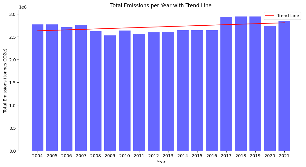
I guess we’ll have to conclude that climate change policies have been an abject failure and the government has been wasting our money.
Well hold on there just a minute. As much as I believe that, in general, governments waste money and return precious little of value to us in exchange, that might not be the case here. Remember: that chart used total emissions which is a terrible way to represent this particular dataset. That’s because the number of reporting sources has increased substantially from just 326 in 2004 to 1,732 in 2021. Obviously the total emissions numbers will rise.
Instead, let’s look at the average annual emissions of all reporting operations:
That’s a bit different, isn’t it? No need for a trend line there.
The massive emissions drop in 2009 might be partly a consequence of the 2008-9 financial crisis. However, the fact that the lower levels were sustained through the years of recovery - including Stephen Harper’s full term as prime minister - suggests there’s something else going on. And what about that second drop in 2017? That would have been just about the time policies put in place by the new Liberal government were kicking in. Does that show a positive return on our $100B+ investment?
Possibly.
Or possibly not. Most federal policies and incentives after 2015 were focused on pushing Canadians to alternative energy sources like wind and solar power and the use of electric vehicles. If those transitions were successful, reduction in CO2 emissions due to weakening demand would only be a secondary impact.
However it’s also possible that consumer demand has remained more or less steady while carbon energy production has become more efficient.
Well which is it? In fact, 2018 and 2019 saw the highest oil consumption of the past decade. As a group, we Canadians were burning through 2.467 (2018) and 2.487 (2019) million barrels of oil a day - significantly more than in the lead up to the 2017 emissions drop.
I certainly can’t rule out any positive impact from Liberal government climate policies. But I think we’d be better off attributing most of the progress we’ve been making in emissions reductions to efficiencies and technological innovation.
UPDATE: Someone in the comments suggested an alternate explanation:
There's a much simpler hypothesis to explain the drops in 2009 and 2017. Since the number of sources has increased substantially over the 18 years shown, it is possible that the later additions were smaller sources, with the government having decided to bring in the highest-emitting sectors first and enlarge the data collection later.
That certainly felt right, so I decided to test the theory. I mined the data for the 20 highest-emitters from 2004 - in other words, the largest of the original reporters. I then tracked their average emissions through the subsequent years to see whether they dropped. Here’s what I got:
The decline in emissions is not nearly as impressive, but it’s still clearly there. So I guess we’re both right: the government did probably focus on the larger emitters early on, but there were also noticeable reductions in operational emissions over time.
I wonder if the direct correlation with emissions and (Canadian) usage is more complicated than this shows due to Canada importing oil from other nations, and exporting products such as LNG and coal to other countries. At any rate, it's a complicated soup, but it makes sense that cleaner operations benefit all. Nevertheless, I appreciate your research.
There's a much simpler hypothesis to explain the drops in 2009 and 2017. Since the number of sources has increased substantially over the 18 years shown, it is possible that the later additions were smaller sources, with the government having decided to bring in the highest-emitting sectors first and enlarge the data collection later. If that's the case, then the first third of the average emissions chart looks at average emissions by large emitters, the second third looks at average by large and medium emitters, and the last third looks at average by large, medium, and small emitters. That would account for both the large drops in 2009 and 2017 and the relative stability of the average between those drops.